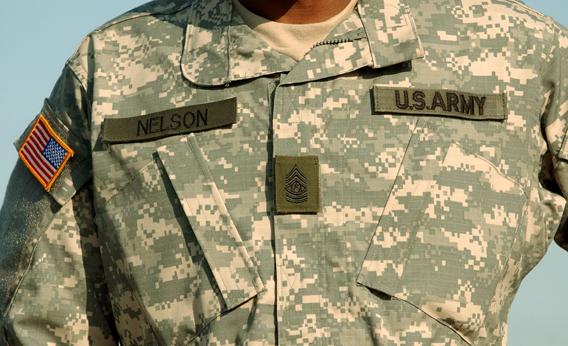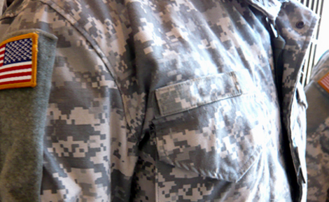
2004 as a one-print-fits-all solution for military deployments around the world, based on the dream of a single outfit that could be worn in every terrain. But as the Daily reported last week, this would-be wonder-pattern was flawed from the start.
 Even before the UCP was issued to soldiers, lab tests showed that it didn't perform as well as other designs. But the Army's textile researchers now say that military brass had already made up their minds in favor of the new-fangled pixelated look. It didn't take long for sergeants to begin complaining from the field, and by the summer of 2009, the $5 billion boondoggle had made its way to the floor of the House of Representatives. Soldiers in Afghanistan were issued replacement uniforms with a more traditional, splotchy camouflage known as MultiCam, and the Army embarked on a three-year study to choose a permanent replacement. That period is almost over, and though critics have focused more on the UCP's washed-out colors than its pixel scheme, it's starting to look as if the military's long-running experiment with "digital camouflage" is about to end, once and for all.
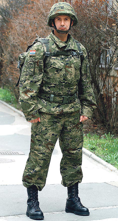
Seen with civilian eyes, the rise and fall of the UCP—and the family of rectilinear camouflage patterns to which it belongs—reads like a parable of irrational exuberance. Pixelated camouflage started to catch on in the technophilic years of the late-1990s, a digital pattern for a dot-com world. By taking the flowing shapes of the old woodland prints and deconstructing them into tiny squares, military engineers applied a computer logic to nature: They made over the science of camouflage, once inspired by the evolution of peppered moths and other animals, into a kind of digital screen-print that could spread through the networked military as a piece of viral media.
The pixel print started (like its analogues in high fashion) as a look-book style for the warrior set. U.S. troops had worn the classic, four-colored Battle Dress Uniform and then a three-color NATO design for decades, but in the early 2000s, the Marine Corps pushed into the avant-garde by donning a digital print borrowed from the Canadians. (That one was first tested in 1998.) When it came time for the Army to update its own uniforms a few years later, the Marines' pixelated "MARPAT" scheme served as the model. "It was trendy," one military textile engineer told the Daily. "If it's good enough for the Marines, why shouldn't the Army have that same cool, new look?"
 That's jumping ahead, though. Pixelated camo prints, or at least the theory behind them, arrived long before the fashion craze. Their history begins with an experimental psychologist (and Jungian analyst) named Lt. Col. Timothy O'Neill. While teaching at West Point, O'Neill thought to apply new ideas about human perception to the art of the concealment. Neuroscientists had divided the human visual system into a pair of parallel circuits with different functions: One neural pathway alerts us to the presence of objects in the world (where is it?), while the other helps us figure out what those objects might be (what is it?).
O'Neill figured that a smart camouflage would have to take account of both pathways, so he devised a pattern with two overlaid textures. At one level, a "micro-pattern" made of discrete color blocks would blend in with the visual noise in a scene and confound the where-is-it pathway. At a second level, those shapes would form a larger "macro-pattern," like the tree branches in a Seurat painting, meant to break up the symmetries of a target and flummox the brain's what-is-it neurons. In 1979, O'Neill's "DualTex" design was blotted onto the vehicles of the 2nd Armored Cavalry Regiment with square sponges, in the first major field test of digital camouflage.

Thematically, culturally, the pixelated pattern made sense. But scientifically, it seemed a little off. Why use squares or rectangles, with their unnatural, hard edges? According to the U.S. patent issued for the Marines' MARPAT camouflage, the selection of four-sided pixels had nothing to do with concealment. Rather, the tiny squares were easier to print on fabric. (The same patent concludes, rather meekly, that "camouflage is an art in the process of becoming a science.") The shape doesn't matter, said the textile engineers, so long as the pixels are applied in the correct proportions of color and brightness.
According to O'Neill, who now works as a consultant and does not endorse any particular pattern now under review, any kind of pixel will do so long as it has clearly defined edges. These are necessary for creating a proper texture match with a natural background, he says, even though the details of the pixel pattern are invisible when viewed from any reasonable distance. When I asked about the fact that an enemy soldier would be likely to see just the macro-pattern of blobs and streaks, and not the smaller dots, he chalked up that observation to a BFO—"a Blinding Flash of the Obvious." The pixels have an effect on your visual system, he assured me, even when they're too small to see. It's complicated, he says, and has to do with something in the cortex called "lateral inhibition."
That didn't sound right. Lateral inhibition, which results from the interaction of adjacent neurons in the retina, helps to sharpen our picture of the world by highlighting the edges of objects. But this mechanism applies at the very earliest stages of vision, using the raw data from your eyeballs. If the photoreceptors in the retina can't make out the tiny dots on someone's uniform, then lateral inhibition wouldn't apply. O'Neill had another reason for why the dots are important, though. He pointed out that dots of a few basic colors can be dithered to create new shades, and a richer palette. (Fun fact: In the late-1980s, O'Neill published a novel called Shades of Gray.)

Whatever the merits of the theory, there's only one way to know for sure if digital camouflage works, and that's by testing it. The Canadians had found that their pattern (later adopted by the Marines) performed well in field tests. But the Army's own pixel print flunked its early trials, finishing below the splotchy MultiCam pattern and a feathery design called Desert Brush. For a follow-up study in 2009, researchers posed models in each of 18 different camouflage suits and nine different settings, and asked soldiers to mouse over photographs and click the hidden targets on a computer screen. (Never mind that the screen itself was pixelated.) The Marine Corps uniforms excelled in certain environments, as did the Desert Brush. But if you looked across the full range of backdrops for a single pattern that blended in everywhere, the MultiCam print did better than either one.
The Army now appears ready to make MultiCam into the new standard. But the data suggest that camouflage testing is itself a tricky and ambiguous art, with the big winner from one study fading in the next round. Even the 2009 experiment, which included almost 900 test subjects, came up with some confusing results: The best "universal" pattern of all—even better than the MultiCam—turned out to be an old-fashioned, unpretentious inkblot of khaki, brown and beige. The researchers had labeled this the "Syria" print, though experts now claim that it's a derivative of a German marsh pattern from the 1950s.
Does this mean the testing methods are faulty? Are the latest theories of camouflage misguided? Whatever the problem, the success of the Syria print casts an ominous shadow over the field. For all our advances in the science of camouflage, from the analogue design of the M81 Woodland to the digital MARPAT prints, and then back to the MultiCam, we're still getting lost in the woods.
By Daniel Engber
----------------
http://www.slate.com/articles/health_and_science/science/2012/07/camouflage_problems_in_the_army_the_ucp_and_the_future_of_digital_camo_.single.html
http://thisiswarblog.files.wordpress.com/2012/06/ucp-camo.jpg
http://www.thedesignfarm.com/blog/wp-content/uploads/2008/04/camo4.jpg
http://www.nivas.hr/blog/wp-content/uploads/2009/03/2009_03_13_vojnik1.jpg
http://strikehold.files.wordpress.com/2010/06/hquktf2010060221.jpg


No comments:
Post a Comment